Visualizing and Summarizing Quantitative Variables
Visualizing with the Grammar of Graphics
<Figure Size: (1280 x 960)>
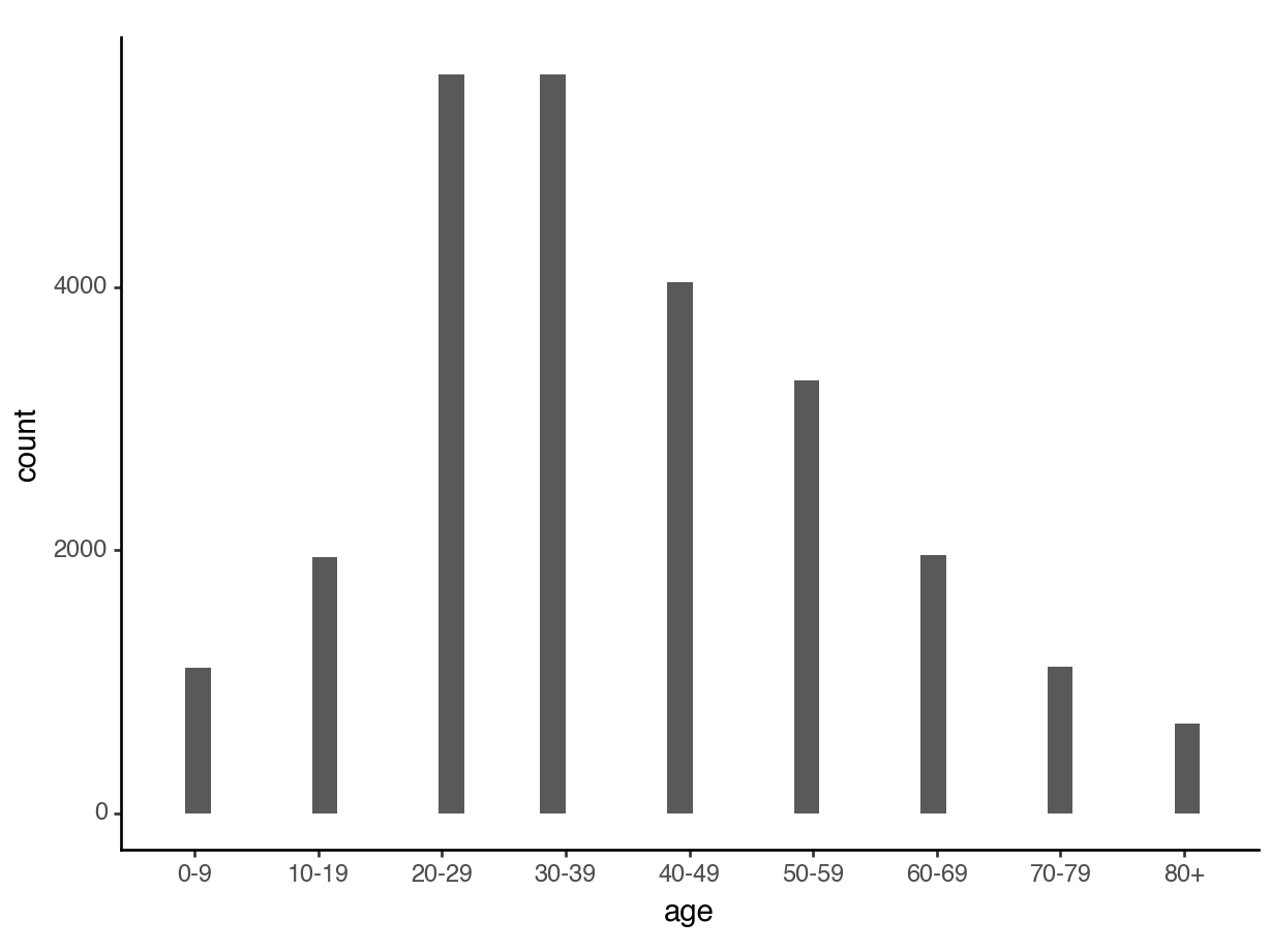
Option: Convert it to categorical
Then, we could treat age as categorical and make a barplot:

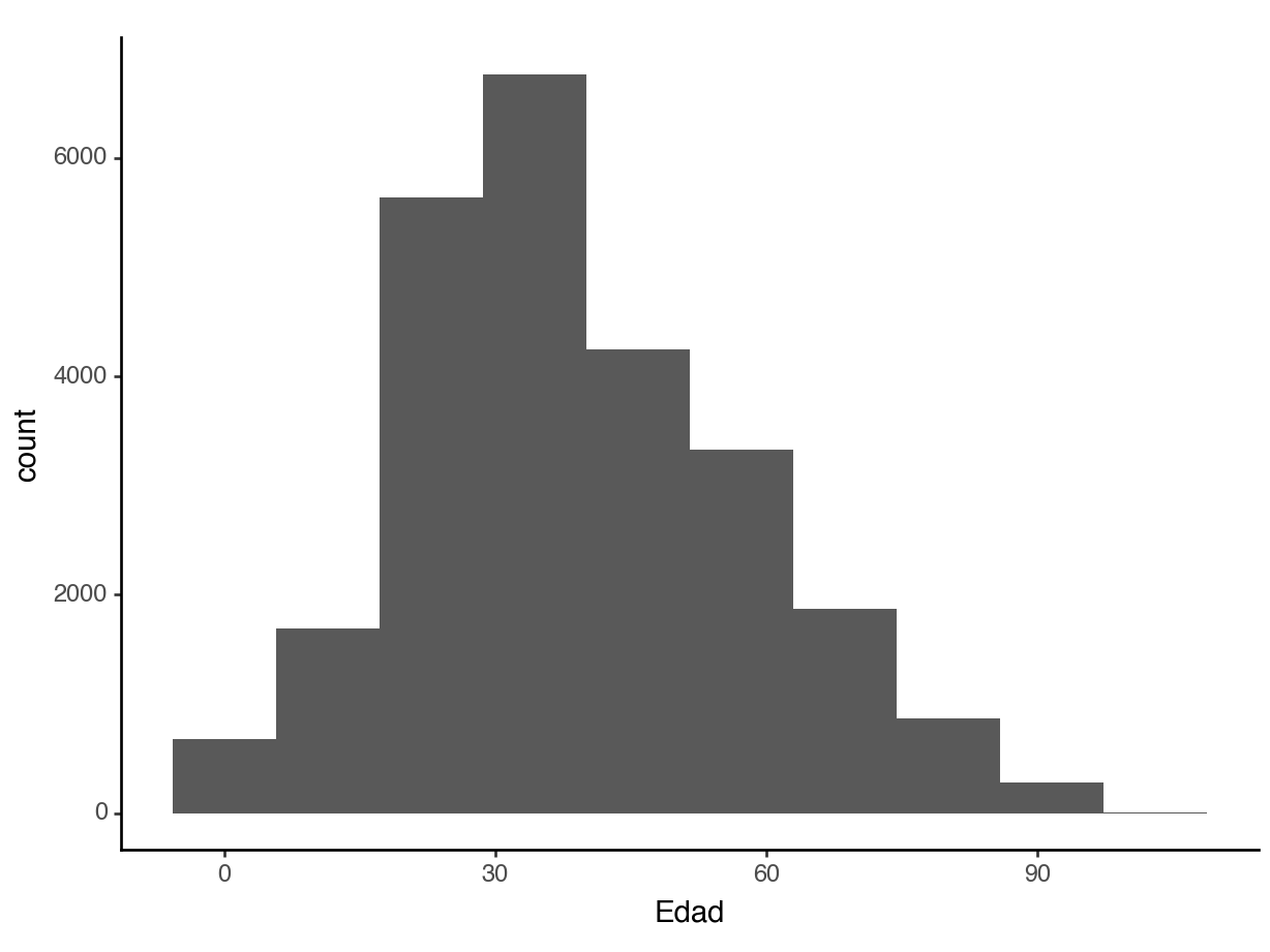
Better option: Histogram
A histogram uses equal sized bins to summarize a quantitative variable.

Histogram
A histogram must use a quantitative variable to look right:
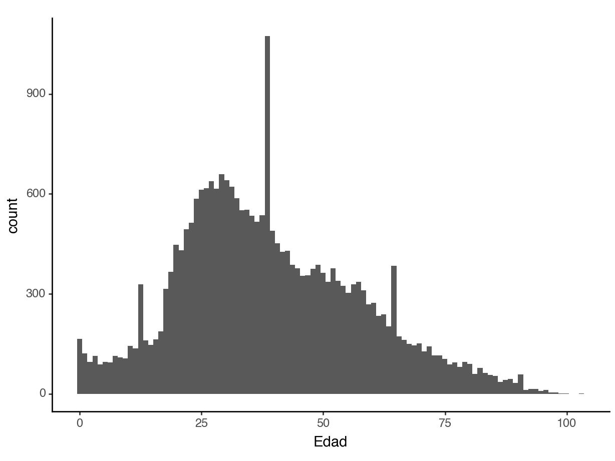
Histogram
To tweak your histogram, you can change the number of bins:
Percents instead of counts
<Figure Size: (1280 x 960)>
Distributions
Recall the distribution of a categorical variable: What are the possible values and how common is each?
The distribution of a quantitative variable is similar: The total area in the histogram is 1.0 (or 100%).
Code
<Figure Size: (1280 x 960)>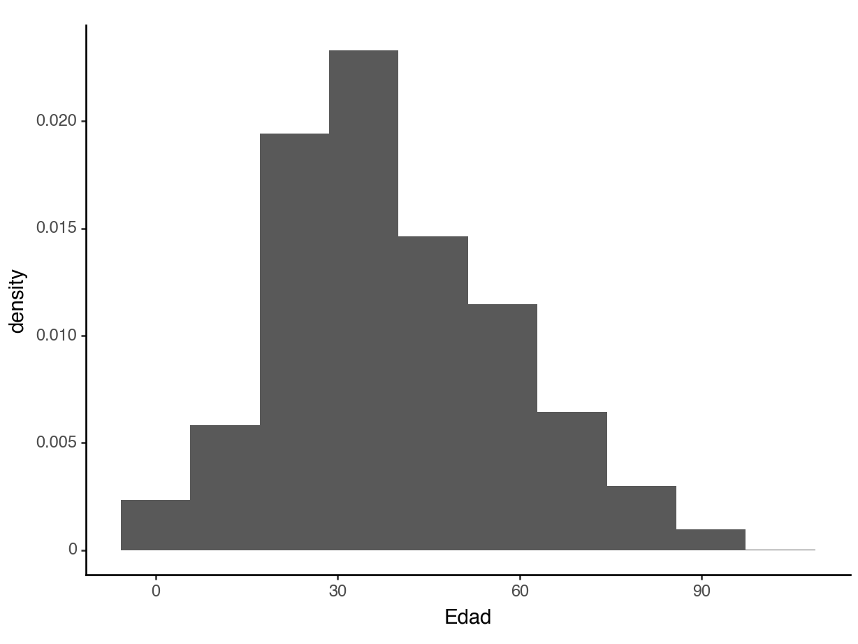
Densities
About what percent of people in this dataset are below 18?
Code
<Figure Size: (1280 x 960)>
Densities
About what percent of people in this dataset are below 18?
<Figure Size: (1280 x 960)>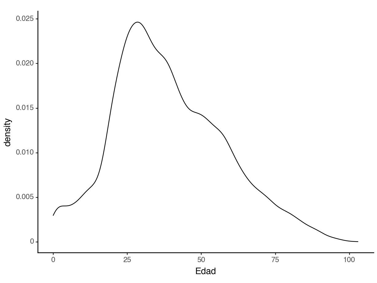
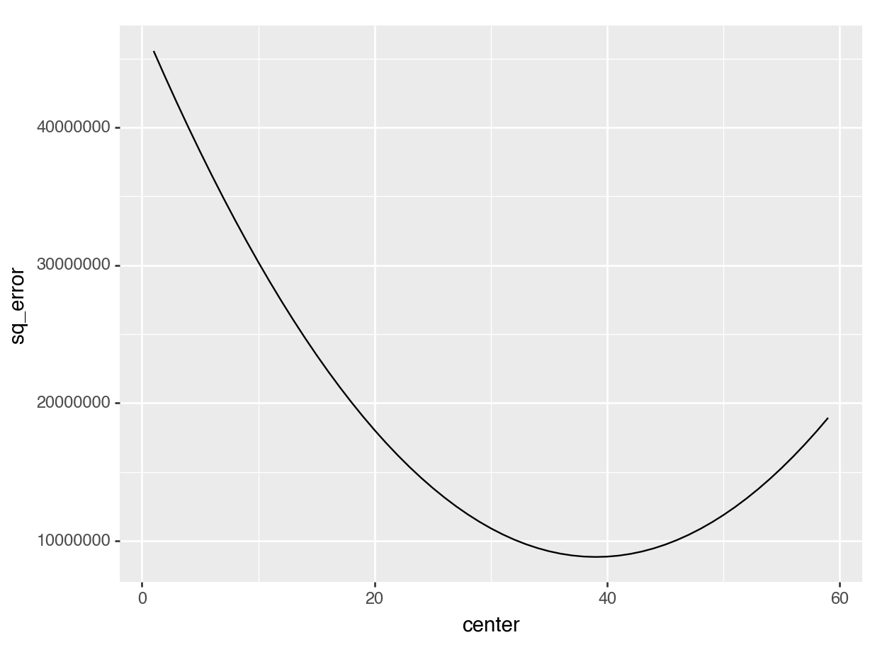
Minimizing squared error
Code
<Figure Size: (1280 x 960)>