library(tidyverse)
library(distributional)
library(gganimate)So, three things happened this week that inspired this tidbit:
I learned about the {distributional} package by … at the UseR 2024 conference, which basically defines distributions as their own objects, to be plotted or used in calculations. Very cool!
I was reminded in a conversation recently that {gganimate} is cool and something I’d like to use more in classes.
A student asked me why QDA can lead to circular boundaries and LDA can’t, when the only difference is whether we let the covariance vary by group. I answered by very badly drawing a series of pictures in the 1-D case.
So my goal here is to re-create those pictures as a gif.
Alright, first thing is to figure out plotting two normal distributions using {distributional}
my_dists <- c(dist_normal(mu = 0, sigma = 1),
              dist_normal(mu = 3, sigma = 1))

my_dists
<distribution[2]>
[1] N(0, 1) N(3, 1)DISTRIBUTIONS AS OBJECTS my people I am so pleased with this structure.
Okay hang on apparently we need ggdist too to plot it… whoa I don’t think I realized how awesome and built-out ggdist is.
Anyways now it’s super easy…
library(ggdist)

ggplot(my_dists) +
  stat_dist_halfeye(aes(dist = dist))
Error in `fortify()`:
! `data` must be a <data.frame>, or an object coercible by `fortify()`,
or a valid <data.frame>-like object coercible by `as.data.frame()`.
Caused by error in `.prevalidate_data_frame_like_object()`:
! `dim(data)` must return an <integer> of length 2.OOPS, famous last words. Of course my objects still need to be in a data frame… duh, Kelly.
my_df <- tibble(
  dist = c(dist_normal(mu = 0, sigma = 1),
              dist_normal(mu = 3, sigma = 1))
)


ggplot(my_df) +
  stat_dist_halfeye(aes(dist = dist))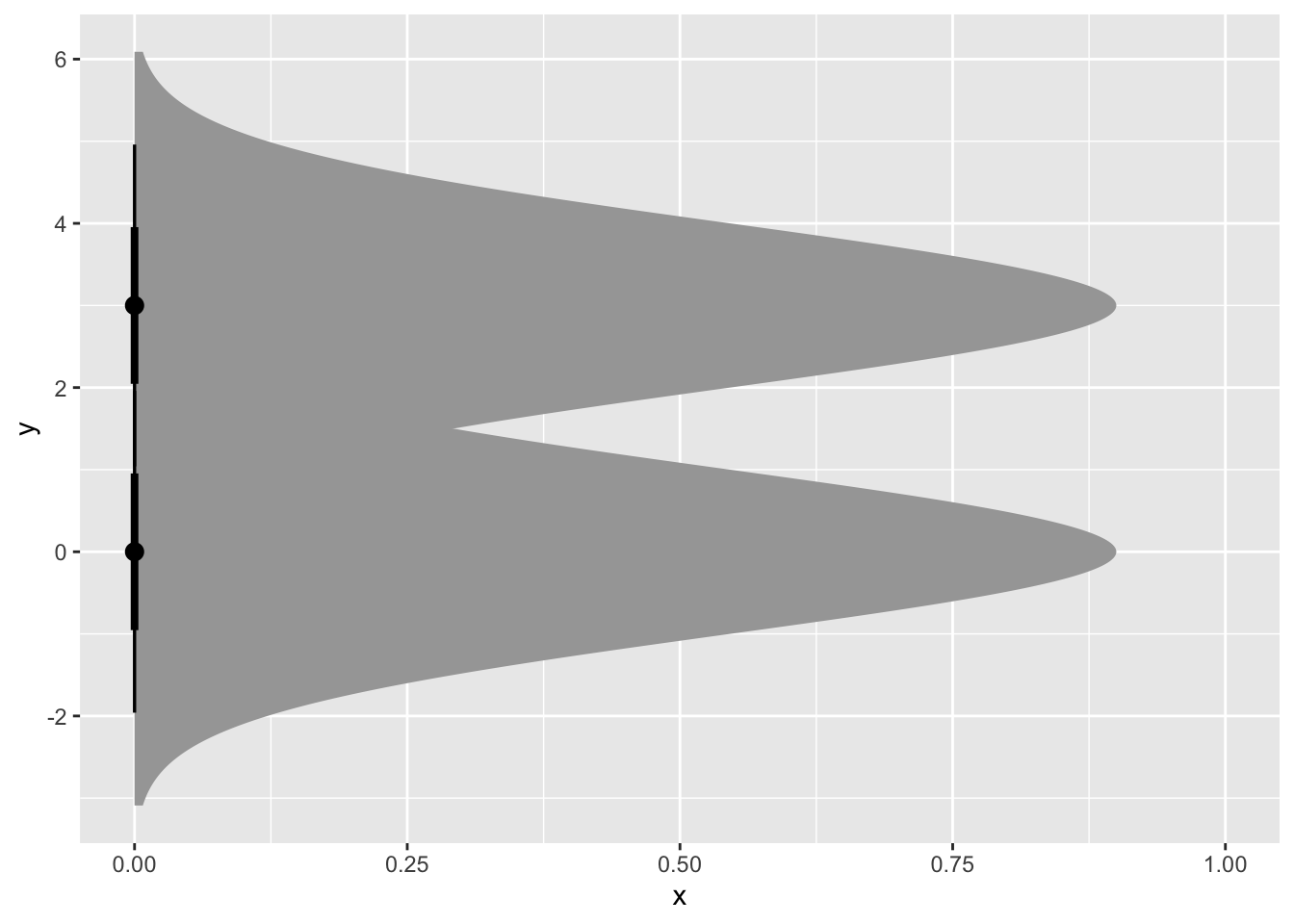
Okay cool but it’s sideways and also I need colors. (Side note, it’s annoying that “distribution” and “distance” are both super common stat words and they have the same natural abbreviation. Rabble rabble.)
A little noodling and cheating with coord flip (there was probably a better way to get these on the x-axis) and I have what I want for now:
my_df <- tibble(
  dist = c(dist_normal(mu = 0, sigma = 1),
              dist_normal(mu = 3, sigma = 1)),
  name = c("Class A", "Class B")
)


ggplot(my_df) +
  stat_dist_halfeye(aes(dist = dist,
                        fill = name),
                    alpha = 0.5) +
  coord_flip() +
  theme_void() +
  theme(legend.position="none")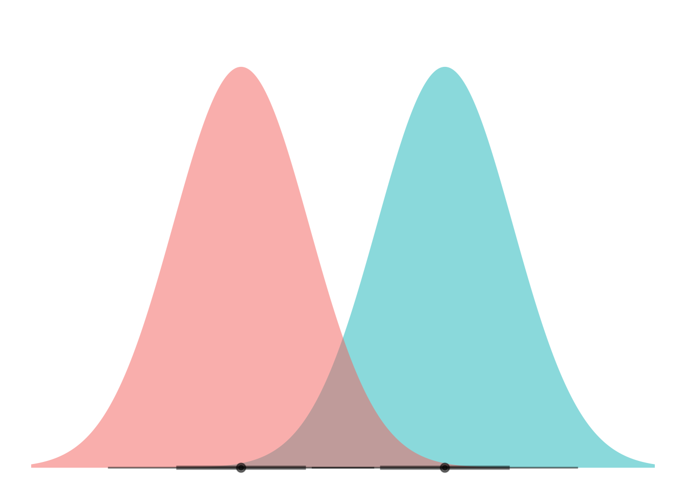
Now we add the lines to show where the decision boundary for LDA would be (assuming equal prior probs here):
ggplot(my_df) +
  stat_dist_halfeye(aes(dist = dist,
                        fill = name),
                    alpha = 0.5) +
  coord_flip() +
  theme_void() +
  theme(legend.position="none") +
geom_hline(yintercept = 1.5) 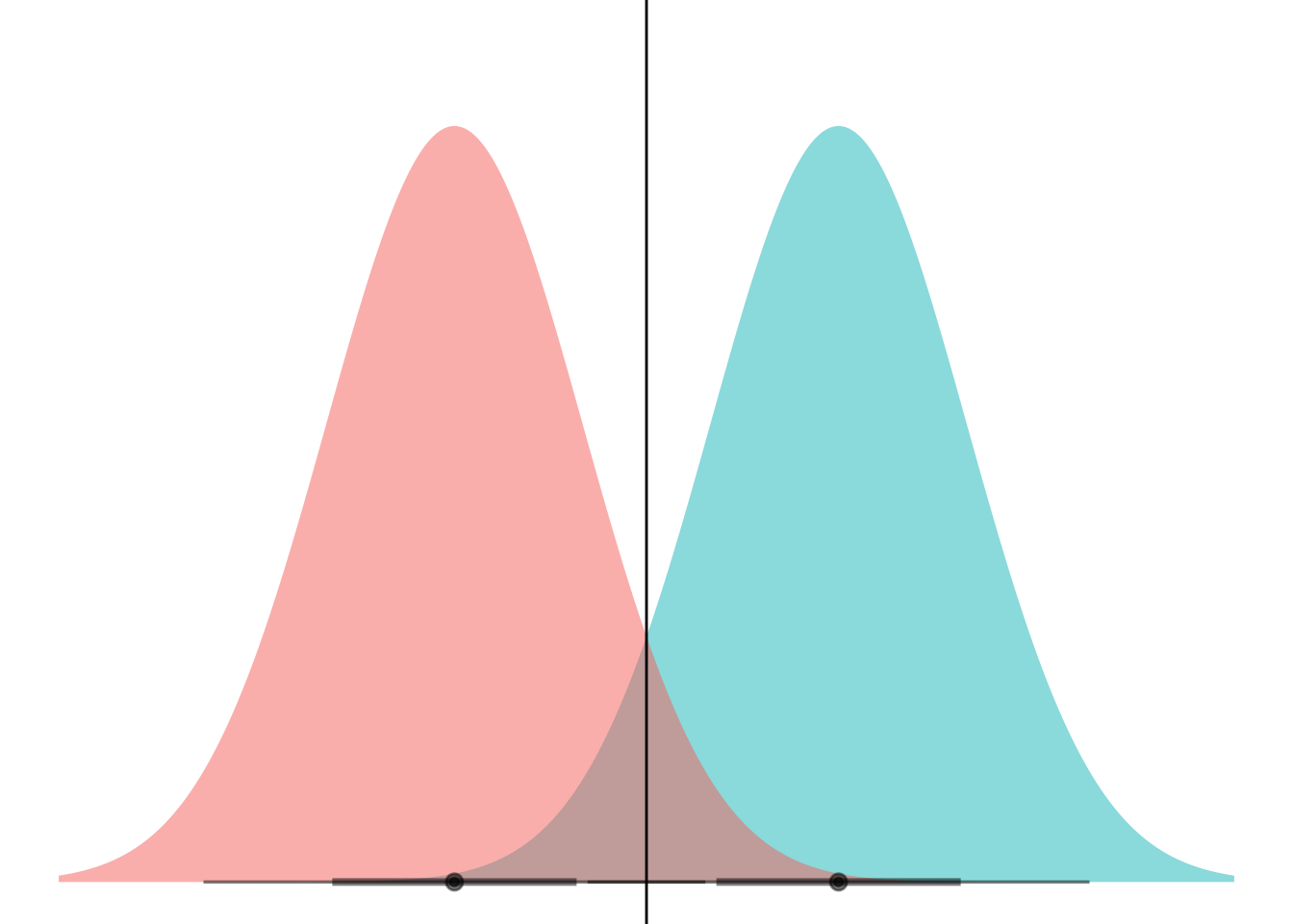
I kinda feel like I should be able to use geom_vline after coord_flip and have it not get flipped because it comes as a later layer. Rabble, rabble.
Anyhoo. Now to animate.
This is a little weird to think about because gganimate wants to step through “state” or values in the data. I think I maybe want to set it up as two separate layers, one with the static blue curve and one with the moving red ones.
my_df <- tibble(
  means = (-8:8)/2,
  dists = dist_normal(mu = means, sigma = 1),
)

ggplot(my_df) +
  stat_dist_halfeye(aes(dist = dists),
                    alpha = 0.5,
                    fill = "#F8766D") +
  stat_dist_halfeye(aes(dist = dist_normal(mu = 0, sigma = 1)),
                    alpha = 0.5,
                    fill = "#00BFC4") +
  coord_flip() +
  theme_void() +
  theme(legend.position="none") +
  geom_hline(aes(yintercept = (means)/2))
Warning in layer_slabinterval(data = data, mapping = mapping, stat = StatSlabinterval, : All aesthetics have length 1, but the data has 17 rows.
ℹ Please consider using `annotate()` or provide this layer with data containing
a single row.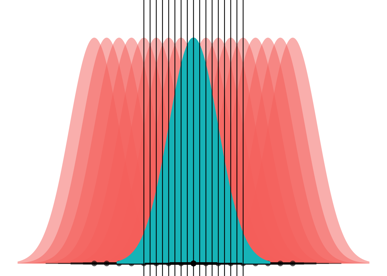
Now I gotta remember how you gganimate a plot. I think you add a layer with some kind of animate_ function?

Ok cool got it:
anim <-
  ggplot(my_df) +
  stat_dist_halfeye(aes(dist = dists),
                    alpha = 0.5,
                    fill = "#F8766D") +
  stat_dist_halfeye(aes(dist = dist_normal(mu = 0, sigma = 1)),
                    alpha = 0.5,
                    fill = "#00BFC4") +
  coord_flip() +
  theme_void() +
  theme(legend.position="none") +
  geom_hline(aes(yintercept = (means)/2)) +
  transition_manual(means)

animate(anim)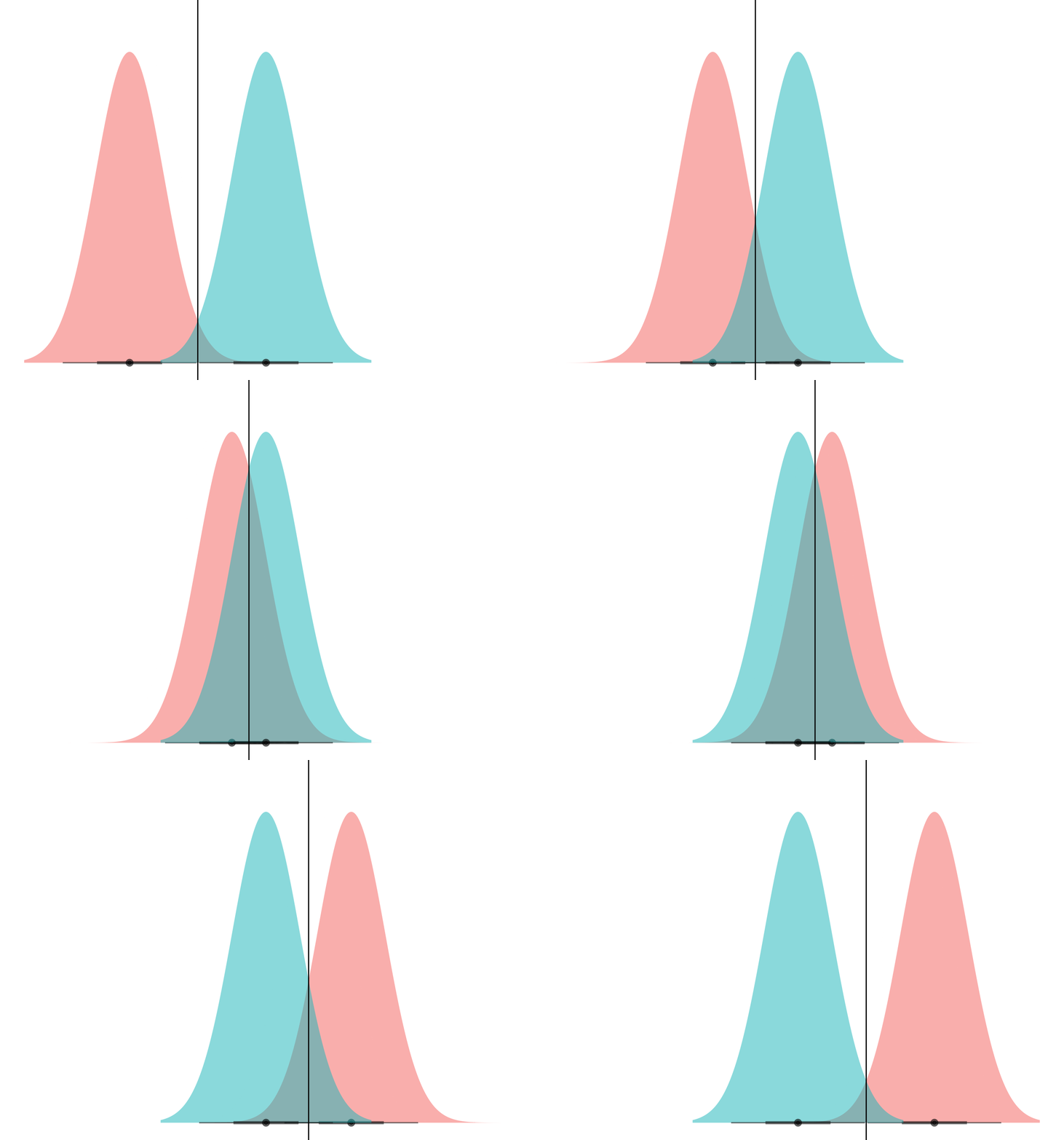
Et voila! What we’re seeing here is that if the curves have the same variance, they can only ever cross at one point. (Well, unless they have the exact same mean and have infinite overlap, but if that’s the case then LDA is pointless anyways.)
So now what if we let them have different variances? We’ll try one for starters:
my_df <- tibble(
  means = -1,
  dists = dist_normal(mu = means, sigma = 3),
)

ggplot(my_df) +
  stat_dist_halfeye(aes(dist = dists),
                    alpha = 0.5,
                    fill = "#F8766D") +
  stat_dist_halfeye(data = NULL, aes(dist = dist_normal(mu = 0, sigma = 1)),
                    alpha = 0.5,
                    fill = "#00BFC4") +
  scale_thickness_shared() +
  coord_flip() +
  theme_void() +
theme(legend.position="none") 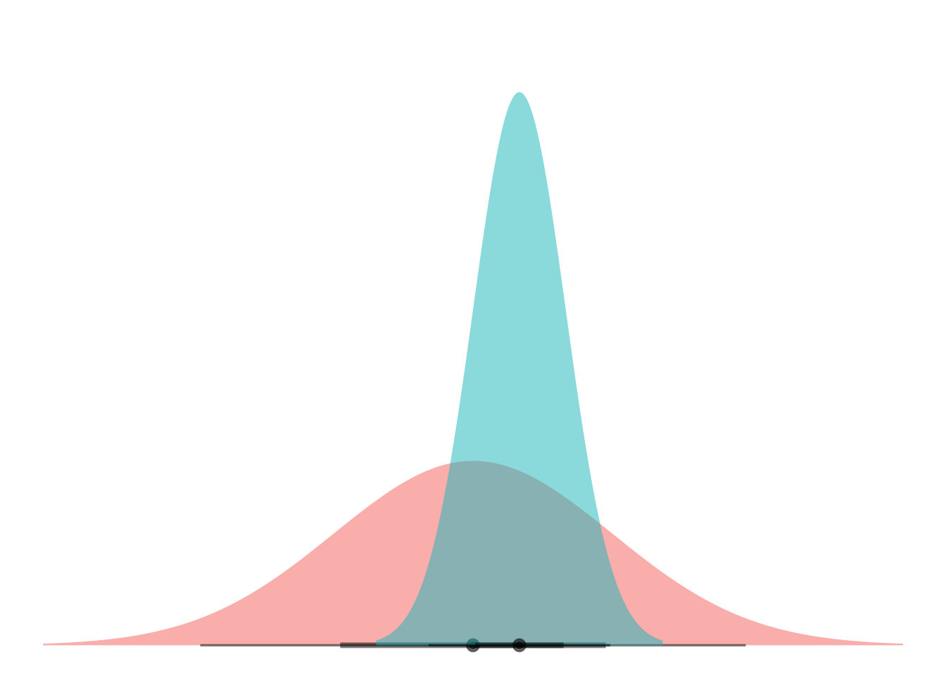
Okay scale_thickness_shared() ended up being really important here to keep the curves from being the same height (and thus different areas, ew).
Finding the intersection point is more of a pain than I thought about at first, because Normal equations are not really closed-form solvable. But distributional makes this not TOO bad at least.
my_df <- tibble(
  means = (-8:8)/2,
  dists = dist_normal(mu = means, sigma = 3),
)

std_normal <- dist_normal(mu = 0, sigma = 1)

grid <- seq(-10, 10, 0.1)
std_dens <- density(std_normal, grid)[[1]]

crosslines <-
  my_df$dists |>
  density(grid) |>
  map(\(dens) order(abs(dens/std_dens - 1))[1:2]) |>
  map(\(idx) sort(grid[idx])) |>
  reduce(rbind)

my_df <-
  my_df |>
  mutate(
    lower = crosslines[,1],
    upper = crosslines[,2]
  )
Phew. That took some doing actually.
BUT! The part you should be excited about here is my_df$dists |> density(grid). Like…. that vectorization is elegant af.
Anyways. Cool. Here’s a gif.
anim <-
  ggplot(my_df) +
  stat_dist_halfeye(aes(dist = dists),
                    alpha = 0.5,
                    fill = "#F8766D") +
  stat_dist_halfeye(data = NULL, aes(dist = dist_normal(mu = 0, sigma = 1)),
                    alpha = 0.5,
                    fill = "#00BFC4") +
  scale_thickness_shared() +
  coord_flip() +
  theme_void() +
  theme(legend.position="none") +
  geom_hline(aes(yintercept = lower)) +
  geom_hline(aes(yintercept = upper)) +
  transition_manual(means)

animate(anim)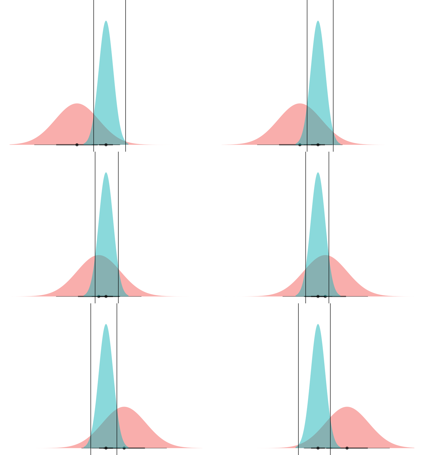
Boom! Two points of intersection, which lets you segment the space such that blue class is “inside” and red class is “outside”.
If you can mental-image this up to two dimensions, maybe you can see how equal-variance bell curves intersect at a straight line, and nonequal-variance onces can have an “inner circle” and “outer circle”, hence LDA vs QDA.
The end!
If I were using this in class, I’d probably add:
Some sample observations, to show that in LDA/QDA these curves are the estimates we get based on observed data, not something we magically know ahead of time.
Some background coloring or arrows or something to clarify that the boundaries are prediction boundaries; we predict red or blue class based on where a new observation lands.
Some aesthetic dressing up: Nice outlines on the curves, a star or something at the density intersection, better colors than red-blue, etc.